uOttawa courses
Creating tools to help students navigate course selection
uOttawa’s tools for course selection aren’t great. I made ones that work for me.
When I started choosing courses for university, I was disappointed to see that all my school offered were long, dense lists of courses, with no ability to sort them.
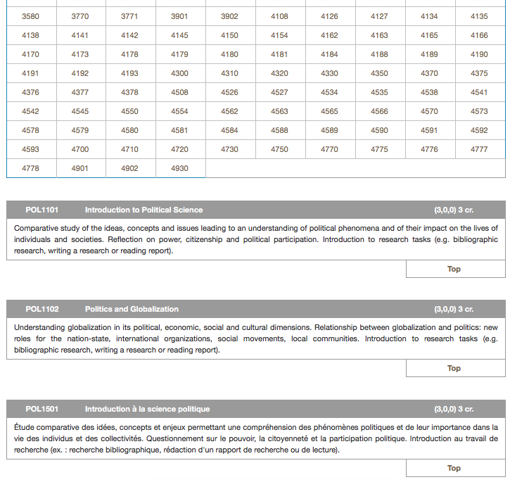
Take, for example, the list of political science courses offered by uOttawa:

This page lists all political science courses offered by uOttawa. Not only does this include first, second, third, and fourth year courses, but it also includes courses in both English and French. uOttawa is a fully bilingual university. Whereas a unilingual university might have 87 undergraduate political science courses for the four years, uOttawa has 174!
Combing through this to make course selections is daunting. Not only are you faced with courses irrelevant to you based on your progress (a first-year student can’t take fourth-year courses, and a fourth-year student probably doesn’t care for first-year courses), but, depending on your linguistic capacity, you must also wade through a list of courses in a language you can’t understand! I saw great potential for improvement.
Scraping the course data
My first step was to obtain the course data. It was all there, on the pages for each discipline, but my sights were set higher than mere style tweaks; I wanted to build new functionality on top of this course data, to make it easier to find and compare courses. For this I needed structured data in a format more usable than HTML.
Fortunately, the markup was structured enough that I could write a downloader and parser which could scrape the courses for any given discipline at uOttawa. This I then converted to JSON, with a generic “course” schema.1 With the structured data in hand, it was time to create an interface to view it, to realize the real value of this endeavour.
Displaying the course data
In order to display the data, I knew I had to build an interface that improved on what I already had available. To this end, I came up with a few goals. The interface had to be:
- Fast
- Filterable
- Searchable
I had always given front-end JavaScript frameworks (AngularJS, React, etc) a hard rap, without giving them a fair chance. In this case, I didn’t have the same constraints that usually steer me away from these frameworks: this project was conceived entirely for my own purposes, so I wasn’t worried about people with less-than-evergreen browsers being hit with roadblocks because of the framework I’d chosen.
I chose Angular to embark on this project, in large part thanks to my friend Roy Sivan’s
consistent work touting its benefits. It made wiring the UI a breeze, and was a blast to learn. (This was Angular 1.x.
Trying to adapt my head to Angular 2.x afterwards hurt my head a fair bit.) This project was also one of the first for which
I used Tachyons; it’s now my go-to for any project when I need to quickly design an interface.
A filterable, searchable interface is probably one of Angular’s most commonly developed examples. I was lucky in this regard, because it gave me a wealth of tutorials to follow along with. I’m a big believer in learning as I go, and this project gave great grounds for it—there was always opportunity to expand the featureset of my interface and learn about some new aspect of Angular.
This phase of the project resulted in a basic interface to view, sort, and select courses for consideration.
Rebuilding in React
A year later, I wanted to practice my skills in React. I rebuilt the course comparator,
with happy results. Down the line, I plan to build a hosted version that stores student selections in a database as
opposed to localStorage, allowing anyone to use it for their own courses.
-
The schema is intentionally generic. If someone wanted to get course data for another school, they could rewrite the downloader and parser to suit, and output to the same structure. This would allow them to take advantage of the course comparator I created, using their own school’s data! ↩